WIP's

Dialogue WIP: Blocking

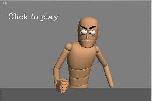
Now that I have more time to do personal stuff, I wanted to start by doing a one character dialogue test. What I wanted to get out of this is learning a new workflow, try out some new techniques, and of course, keep on improving. 😉 I tend to burden myself with other parts of the creation process (modeling, rigging, etc.) and while it’s good to have knowledge of rigging, I should really focus on animating.

I started out by looking for some interesting dialogue from The Daily .Wav. I found a clip from “It’s a Wonderful Life”, which I admit I’ve never seen in its entirety (my boyfriend totally chewed me out about this.) I really love the volatile tone of voice in the clip and thought it’d be fun to try something with such intensity. Afterwards, I shot some reference and did some planning:

I tried to mimic the blocked/stepped approach to animating in 3D where you set a key on every controller on every keyframe you make. To facilitate this in 3dsMax, I changed the option of “Default In/Out Tangents for New Keys” to stepped. You can find it right below the timeline on the main UI. I also used the “Key Mode Toggle” (which is that pair of arrows next to the right of “Key Filters”) when I needed to jump from pose to pose with my arrow keys.

Working in this fashion so far, I have to say it’s a lot nicer than the PC distracting you with its ‘tweening. It also made me more conscious of posing, which is one of the major things I want to work on within animation. To keep myself in check, I followed Victor Navone’s advice and made sure there was a key at least every 4 frames. Another source of inspiration was looking at Brandon Beckstead’s tightly blocked work.

I’m still a beginner at this, so if you have any crits on the poses or timing, lemme know! I’m focusing more on the body right now; though if you have any suggestions for the eyes, that’d be great to hear too. I’m really enjoying this workflow, and hopefully with more practice it’ll come more naturally. 🙂


Points of Interest

United Olympics Commercials

One of five United Airlines commercials
Two Worlds: One of five United Airlines commercials

While the Olympics are an exciting and inspirational thing to watch, I am absolutely pleased with the commercials’ offerings in-between. Last night, I caught one of the five United Airlines commercials airing during the Olympics. From paper cut-out and CG, to salt on glass, the art direction for each commercial is imaginative, refreshing, and simply gorgeous. These commercials were produced by BDM, an ad agency based in Minneapolis. Each of these commercials features Gershwin’s “Rhapsody in Blue”, United’s personal theme.

I was able to find Youtube versions of each, but you should definitely check out the hi-res versions either on their website or via the links provided.

(All descriptions below are taken from the United Airlines’ Press Release.)

Sea Orchestra


“Sea Orchestra” (60 seconds) – “Sea Orchestra” is a lively and visually rich commercial that introduces United’s new international first and business class cabins. In it, a United airplane crosses the ocean and is serenaded by an orchestra of animated sea creatures that are playing a unique version of Rhapsody in Blue using tubas, violins, French horns and the Indonesian gamelan. The score was created by Shy the Sun, a South Africa-based directing team, which used hand-drawn textures, computer animation characters and photographs of water, reefs and skies.

Two Worlds


“Two Worlds” (60 seconds) – “Two Worlds” is a celebration of color and beautiful images that portrays United’s effect on international travelers. In it, a weary business traveler leaves a mundane, monotonous black and white world and enters a fantasy of color, representing United’s new international first and business class service. When he lands, he is once again in a black and white world, but has brought a bit of the magic of the new United experience with him. The commercial combines two different and distinctive animation styles created by directors SSSR, a Norwegian and Japanese team, who was responsible for the monochromatic world that was mostly computer-generated with a hand-crafted feel, and Gaelle Denis, a French director, who was responsible for the colorful fantasy world that uses using live action, computer generation and matte paintings, including textures such as Japanese rice paper.

Heart


“Heart” (60-seconds) – “Heart,” United’s new brand ad, portrays the connection between a husband and wife and United’s role in reuniting them. The commercial depicts a woman leaving her husband to fly to Europe for a business presentation. As she says goodbye, she leaves her heart behind as a symbol of her love. The musical score for “Heart” is a piano duet of Rhapsody in Blue performed by Herbie Hancock and Lang Lang, who recently performed Rhapsody in Blue together at the 2007 Grammy Awards. Using stop-motion animation and paper puppetry, California-based director Jamie Caliri and his team, place dimensional cardboard puppets in miniature sets that were shot frame by frame.

Butterfly


“Butterfly” (30 seconds) – “Butterfly” is a fluid, animated commercial with an artistic interpretation of flying in United’s new international first and business class cabins. The spot focuses on United’s 180-degree flat-bed business class seats and comes to life against a violin version of George Gershwin’s Rhapsody in Blue. In this spot, the Polish director Aleksandra Korejwo manipulated colored salt using shed condor bird feathers on a black canvas positioned under a downward-facing camera.

Moondust


“Moondust” (60 seconds and 30 second) – “Moondust” is a luminous, dreamlike commercial with an artistic interpretation of flying in United’s new international first and business class cabins. The spot focuses on United’s 180-degree, flat-bed business class seats and is animated to a spare, intimate interpretation of George Gershwin’s Rhapsody in Blue. Ishu Patel, an Indian-born and Canadian-based animator, used his world-renowned back-lit technique in which a thin layer of plastic modeling clay is applied to a glass plate that has a 1000-watt light positioned beneath it and an animation camera above it.

Updates

Dead Head Fred stuff!

The cooler box art of DHF, Japan-only

Almost a year later, I finally post my work from Dead Head Fred. The animation section has a reel with some of the animations I did, and the Artwork: 3d section has a pic of some modeling/texture work.

The above picture is the box art from the Japanese version of our game. It’s 100x cooler than the U.S. released box art, imho. The Japanese website also has tons of extras like a chibi style comic strip and various wallpapers. It’s always neat to see how games are localized for different countries. You should check it out.

Points of Interest

It is normal.


I have an incredibly hard time finding professional advice pertaining to the industry I work in. Both my parents and most my relatives have traditional professions in medicine, education, or business. Art school instructed me mostly in the technical aspects of being an animator. But, motivating yourself when you’re feeling defeated, dealing with long hours and heavy workloads, interacting with your co-workers…experience is the primary teacher. When you’re on your own, you’re never sure if what you experience as a young creative professional is normal because you may be surrounded by lots of people with experience, who have been doing it for a long time. And you occasionally question if you made the right decision, especially when your work or project isn’t turning out the way you wanted. It’s tough starting out with little experience, lots of ambition, and more to prove.

Every once in awhile, I find some open, honest advice like the video above. (Thanks to 43 Folders) Although Ira Glass of This American Life works primarily for broadcast, the experience is still applicable to anyone who works in a creative field. It is wonderful that more creative professionals are documenting their conclusions drawn from experience, observations, and lessons learned online. It gives inspiration to us kids, who are no longer shielded by academia’s umbrella, to pick ourselves up and keep marching on.

Updates

Thundercats are GO!

My website is fully operational. I ironed out most of the bugs. Any remaining ones are small visual nuances that you probably won’t notice (I hope.) I also got the RSS feed up and running again…unfortunately that involved me deleting my previous one with Feedburner and creating a new one. So if you were one of the 2 people that subscribed to my page, you’ll have to re-subscribe using my RSS feed link on this page. Sorry!

Points of Interest

Batman: Gotham Knight

Working through Pain

I’ll be honest with you: I know nothing about superhero comics or Batman beyond what I’ve seen from the stunning Batman animated tv series from the 90’s and the movie line featuring the likes of Keaton, Kilmer, Clooney, and Bale. I know the basics of Batman’s history, some of the major villains, and his close confidants. I preface this because I’ve read mixed reviews from Batman fans pertaining to Batman: Gotham Knight, which was recently released this past Tuesday.

After watching my Blu-Ray copy of the Gotham Knight, all I can say is: WOW.

From an animation standpoint this is an amazing visual treat. Similar to The Animatrix, this collection tells episodic stories surrounding Batman. It features animation powerhouses Studio 4ºC (Tekkon KinKreet), Madhouse (Paprika), Production I.G. (Ghost in the Shell), and Bee Train (Noir). All 6 stories are loosely linked together with recurring characters and take place between Batman Begins and the upcoming Batman Dark Knight.

What really sold me on these vignettes is how they opt for a more intimate narrative beyond a typical superhero vs. villain structure. The focus is not particularly on the villains (which I’m sure angered a lot of fans), but rather on the qualities that make Batman who he is: powerful, resourceful, noble…human. Two of the stories that perfectly illustrate this theme are produced by Studio 4ºC: “Have I Got a Story For You” and “Working Through Pain” (which the above image is taken from). Unsurprisingly, these are my favorites from this collection. (On a side note: these 2 shorts have made me a Studio 4ºC convert.)

Each story has its own distinct visual style and the production quality is top-notch. There are intricate backgrounds and frenetic fight sequences galore. There is something special about each visual interpretation of Batman and his beloved Gotham City. I must admit, however, that if you’re not a fan of the anime style, you may not appreciate the work entirely.

I’m not going to bore you with the details, but if you are looking for some high quality animation or are a fan of any of the aforementioned studios, it deserves your attention. If you don’t like it, at least you get $3 off the movie concession stand if you purchase it from Best Buy.

Sketches · Updates

Site Overhaul + Life Drawings

As you can tell, I remade my site yet again. There’s a few bugs here and there I need to fix (i.e. my RSS feed not working and the extra space found beneath my artwork pages), but for the most part this is it. I restructured my site so it’ll be more organized and cleaner in design. For the tiled background, I used this awesome pattern from Din Pattern. If you’re ever looking for some background tiles, I highly recommend the site.

Above are some life drawings from last night’s session. I haven’t been to one in forever due to crunch. I used a Uniball Signo pen, after reading about it in Enrico Casarosa’s blog. I have to say, this has become my new favorite fine pen as well. The ink flows so smoothly you don’t want to lift your pen, hehe. It’ll be a fine addition to my travel sketching materials. 🙂

Unfortunately, next week we’re re-entering crunch so you may not see more life drawings until August. In the meantime, though, I will be posting other stuff *koff koff animation*. So thanks for visiting, and let me know if anything looks bizarre on your browser.

Sketches

Take luck!

A gesture drawing with some flat colors of my mentor/friend, Hongman, who is moving on to another job in Seattle. It’s from my desk’s vantage point, and that’s really what I saw on his monitors from a day-to-day basis.

Hongman is possibly one of the hardest working animators I know, very talented, and humble to boot. He was one of the first friends I’ve made at VCS, and he never complained about my pestering him with my novice questions. Good luck, Hongman! You’ll be missed!

Sketches

Some travel sketches

Last year, I traveled to Japan to visit my friend who was teaching English at a high school over there. The beginning of my trip started out a little rocky; the 2nd leg of my connecting flight to Tokyo was canceled due to a typhoon, leaving me stranded in Texas for a day. Luckily, I sneaked onto a flight the following morning, sitting in the center of a 5 seat row. The first two pages are my fellow passengers to the left and right of me.

When I finally arrived, my friend was kind enough to let me tag along when she went to work. I had a blast drawing the high schoolers because they were so lively…but it also made it hard to capture that spirit. I was also intrigued by their little nuances in how they wore their school uniforms. So much personality!

This was the first time I tried to really document another location with sketches. It was extremely fun, and now when I look back at these sketches I can remember more specifics than if I just shot it with a camera. For the sketchbook, I used a water brush, watercolor pencils, pencil, and Sakura Microns/Copic Multiliners. The moleskine’s thick paper held up pretty well to the water media, but it’s hard to make a mark with straight up water color. I found I had to draw with the water color pencil and then apply water to the line to make it keep. I’ll try to find more time later to post more from my travel sketchbook…unfortunately at work we’ve entered crunch mode so updates will be sparse.

Personal

A screever’s an artist of ‘ighest degree

Recently, a group of my friends and I went down to Savannah, GA to meet up for a mini-reunion and to participate in our alma mater’s Sidewalk Arts Festival. It was really nostalgic visiting our old haunts from our college days. Funny how only 2 years after graduating everything already feels tucked away in the distant past.

For those unfamiliar with the SWA, participants are assigned a square of concrete throughout Forsyth Park, one of the largest parks in Savannah, and are given a box of 12 brightly colored chalk. In a certain amount of time (usually 3-4 hrs), participants can draw whatever they want. Accompanying this competition are lots of other events such as live performances, games, etc. It’s open to the public, and a perfect excuse to play outside.

I’ve participated since I was a freshman at SCAD, so I decided to post pictures of this year’s square, along with some I managed to salvage from the past.

(who can guess this post title’s reference?)